
As part of our supporting data and maps for Space For Cycling, we have reworked the freely available Department For Transport vehicle count data into a more usable form and added PCU counts.
This is available on Google Fusion Tables for anyone to use and rework. Please credit our work and let us know if you have any queries.
Purpose and inspiration
The primary purpose of this data is to provide easily usable vehicle counts and PCU figures for vehicles to support cycle activism. It may be reusable for other purposes, but you may find some data for that purpose has been dropped from the original data.
Key to realising the need for this data was looking again at Rachel Aldred’s comments on the recently adopted LCC policy on 2000 PCU as a threshold. DfT provide their own map of this data, but all it does is tell you what id number each point has. We provide an inline table as a popup for easy viewing of figures.
Key terms used in this data and calculation used
PCU – a piece of traffic modelling terminology, meaning Passenger Car Units. Essentially it is an expression of space used on the road. It’s not perfect, but it’s the most useful thing out there and easy to calculate.
To calculate the PCU for a vehicle type you take the count of their number and multiply it by the PCU Value assigned. For PCU calculations we have used the table printed in TfL’s own modelling guidelines (page 67):
| Vehicle Type | PCU Value |
|---|---|
| Pedal Cycle | 0.2 |
| Motor Cycle (Powered 2 Wheelers) | 0.4 |
| Passenger Car | 1.0 |
| Light Goods Vehicle (LGV) – under 3.5 tonnes | 1.0 |
| Medium Goods Vehicle (MGV) – over 3.5 tonnes | 1.5 |
| Buses & Coaches | 2.0 |
| Heavy Goods Vehicle (HGV) – over 3.5 tonnes with 3 or more axles | 2.3 |
Explanation of Count Points Map
The count points map aims to provide a direct and easy to interrogate map of all Count Points in the UK. Unfortunately some points have no location information. We have excluded these from our list.
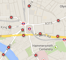
Each point that shows on the Count Points map is a single count point.
You will find that generally count points are not directly at junctions but are some way back from them. Sometimes key locations have two count points such as Hammersmith Bridge. This is so that there are count points in the borough on either side. Major road count points are typically taken every year but you will find some minor roads especially and some major roads where counts are irregular or were discontinued.

Clicking on a count point opens a pop-up with tells you the number and road for the point, along with details of the local council ward and borough (reliable in London, less so elsewhere).
The table shows the vehicle counts by type for each of the years from 2003-2012 that this count point has data. There are then two summary entries, one for all motor vehicles (all bar cycles) and the other for all Motor PCU values summed.
Finally in a line at the end the PCU value for the most recent year is broken down by mode, including the cycle PCU value (which is not included in the motor PCU sum).
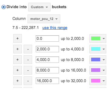
Key for main roads Motors PCU vs. Cycles

There is a more complicated in construction and yet simpler to view map which attempts to contrast motor vehicle PCU levels (shown as colour) against cycle counts (shown as width). DfT provide a (greatly simplified) shapefile of the major road network which relates it back to count points. As this is only major roads it is not helpful for mapping cycle activity as a whole but it is helpful for portraying some of the issues of conflict.
We’re open to suggestions on how to best arrange this, but currently the key for it is:
Motor vehicle PCU values resulting in the following colours –
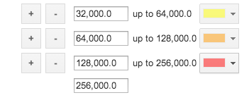
Cycle counts resulting in the following widths –


As both double up the scale they’re sort of logarithmic. This was the best compromise we reached, we’re open to suggestions! You can copy the table and make your own attempt by editing the map view.
Data interpretation, and possible limits
This data is most accurate for counts of motorised vehicles. Counts of cycles are widely considered to be varying here due to a mix of methodologies and equipment used. Note that sometimes counts may have shifted to count the same flow of vehicles if it was diverted. This appears to have happened with the Hammersmith Flyover count which now counts vehicles on Hammersmith Broadway as well.
In short – if the cycle count suddenly leaps from one year to another it’s more likely a change in the way that count was made unless you can tie it back to a local event.
Generally all that matters is the most recent All Motor PCU value, but reviewing the data for past years counts by vehicle types may relate to recent construction or other works if vehicles such as HGVs are changing.
How we’ve done it
We took the Department for Transport data and ran an series of SQL commands over it in PostgreSQL 9.3 with PostGIS enabled (on a windows PC as it happens) then uploaded the resulting table to google fusion tables. To upload the 20MB+ of data into google fusion tables we first uploaded a few lines from an excel file, deleted all imported rows then imported the complete set of data but uploaded a full CSV file as extra rows.
Once data was live in google fusion tables we applied a template for the pop-ups to render the table and applied a custom format on the second map of main roads to make colour and width reflect values (as shown above as key).